Image
Displays an image with preview and tranformation options.
Import #
import { ImageModule } from 'primeng/image';
Basic #
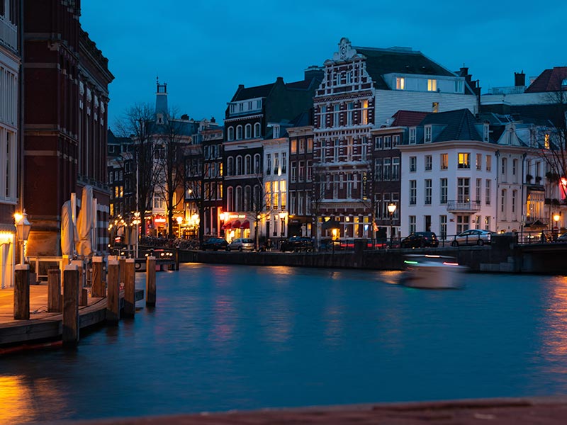
Image is used as the native img element and supports all properties that the native element has. For multiple image, see Galleria.

<p-image src="https://primefaces.org/cdn/primeng/images/galleria/galleria10.jpg" alt="Image" width="250" />
Preview #
Preview mode displays a modal layer when the image is clicked that provides transformation options such as rotating and zooming.

<p-image src="https://primefaces.org/cdn/primeng/images/galleria/galleria10.jpg" alt="Image" width="250" [preview]="true" />
Template #
An eye icon is displayed by default when the image is hovered in preview mode. Use the indicator template for custom content.

<p-image src="https://primefaces.org/cdn/primeng/images/galleria/galleria11.jpg" [preview]="true" alt="Image" width="250">
    <ng-template pTemplate="indicator">
        <i class="pi pi-search"></i>
    </ng-template>
    <ng-template pTemplate="image">
        <img src="https://primefaces.org/cdn/primeng/images/galleria/galleria11.jpg" alt="image" width="250" />
    </ng-template>
    <ng-template pTemplate="preview" let-style="style" let-previewCallback="previewCallback">
        <img src="https://primefaces.org/cdn/primeng/images/galleria/galleria11.jpg" alt="image" [style]="style" (click)="previewCallback()" />
    </ng-template>
</p-image>
Accessibility #
Screen Reader
The preview button is a native button element with an aria-label that refers to the aria.zoomImage property of the locale API by default.
When preview is active, dialog role with aria-modal is applied to the overlay image container.
Button controls use aria.rotateRight, aria.rotateLeft, aria.zoomIn, aria.zoomOut and aria.close from the locale API as aria-label.
ButtonBar Keyboard Support
When preview is activated, close button receives the initial focus.
| Key | Function |
|---|---|
| tab | Moves focus through button bar. |
| enter | Activates the button. |
| space | Activates the button. |
| esc | Closes the image preview. |