OrderList
OrderList is used to sort a collection.
Import #
import { OrderListModule } from 'primeng/orderlist';
Basic #
OrderList is used as a controlled input with value properties. Content of a list item needs to be defined with the pTemplate property that receives an object in the list as parameter.
- Bamboo Watch
- Black Watch
- Blue Band
- Blue T-Shirt
- Bracelet
- Brown Purse
- Chakra Bracelet
- Galaxy Earrings
- Game Controller
- Gaming Set
<p-orderlist [value]="products" dataKey="id" breakpoint="575px">
    <ng-template pTemplate="option" let-option>
        {{ option.name }}
    </ng-template>
</p-orderlist>
Filter #
Filter value is checked against the property of an object configured with the filterBy property
 Bamboo WatchAccessories$65
 Black WatchAccessories$72
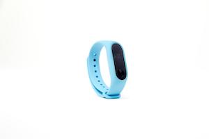 Blue BandFitness$79
 Blue T-ShirtClothing$29
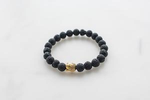 BraceletAccessories$15
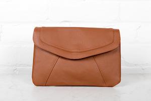 Brown PurseAccessories$120
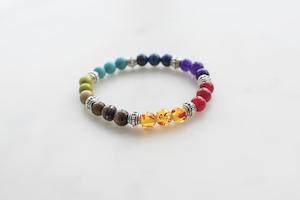 Chakra BraceletAccessories$32
 Galaxy EarringsAccessories$34
 Game ControllerElectronics$99
 Gaming SetElectronics$299
<p-orderlist
    [value]="products"
    [listStyle]="{ 'max-height': '30rem' }"
    filterBy="name"
    filterPlaceholder="Filter by name"
>
    <ng-template let-option let-selected="selected" pTemplate="option">
        <div class="flex flex-wrap p-1 items-center gap-4 w-full">
            <img
                class="w-12 shrink-0 rounded"
                src="https://primefaces.org/cdn/primeng/images/demo/product/{{ option.image }}"
                [alt]="option.name"
            />
            <div class="flex-1 flex flex-col">
                <span class="font-medium text-sm">{{ option.name }}</span>
                <span
                    [ngClass]="{
                        'text-sm': true,
                        'text-surface-500': !selected,
                        'dark:text-surface-400': !selected,
                        'text-inherit': selected,
                    }"
                    >{{ option.category }}</span
                >
            </div>
            <span class="font-bold sm:ml-8">{{ '$' + option.price }}</span>
        </div>
    </ng-template>
</p-orderlist>
Template #
For custom content support define an option template that gets the item instance as a parameter. In addition header template is provided for further customization.
- Bamboo WatchAccessories$65
- Black WatchAccessories$72
- Blue BandFitness$79
- Blue T-ShirtClothing$29
- BraceletAccessories$15
- Brown PurseAccessories$120
- Chakra BraceletAccessories$32
- Galaxy EarringsAccessories$34
- Game ControllerElectronics$99
- Gaming SetElectronics$299
<p-orderlist
    [value]="products"
    dataKey="id"
    breakpoint="575px"
    scrollHeight="20rem"
>
    <ng-template let-option let-selected="selected" #item>
        <div class="flex flex-wrap p-1 items-center gap-4 w-full">
            <img
                class="w-12 shrink-0 rounded"
                src="https://primefaces.org/cdn/primeng/images/demo/product/{{ option.image }}"
                [alt]="option.name"
            />
            <div class="flex-1 flex flex-col">
                <span class="font-medium text-sm">{{ option.name }}</span>
                <span
                    [ngClass]="{
                        'text-sm': true,
                        'text-surface-500': !selected,
                        'dark:text-surface-400': !selected,
                        'text-inherit': selected,
                    }"
                    >{{ option.category }}</span
                >
            </div>
            <span class="font-bold sm:ml-8">{{ '$' + option.price }}</span>
        </div>
    </ng-template>
</p-orderlist>
Accessibility #
Screen Reader
Value to describe the source listbox and target listbox can be provided with sourceListProps and targetListProps by passing aria-labelledby or aria-label props. The list elements has a listbox role with the aria-multiselectable attribute. Each list item has an option role with aria-selected and aria-disabled as their attributes.
Controls buttons are button elements with an aria-label that refers to the aria.moveTop, aria.moveUp, aria.moveDown, aria.moveBottom,aria.moveTo, aria.moveAllTo, aria.moveFrom and aria.moveAllFrom properties of the locale API by default, alternatively you may usemoveTopButtonProps, moveUpButtonProps, moveDownButtonProps, moveToButtonProps, moveAllToButtonProps, moveFromButtonProps, moveFromButtonProps and moveAllFromButtonProps to customize the buttons like overriding the default aria-label attributes.
<span id="lb">Options</span>
<p-orderlist ariaLabelledBy="lb" />

<p-orderlist ariaLabel="City" />
OrderList Keyboard Support
| Key | Function |
|---|---|
| tab | Moves focus to the first selected option, if there is none then first option receives the focus. |
| up arrow | Moves focus to the previous option. |
| down arrow | Moves focus to the next option. |
| enter | Toggles the selected state of the focused option. |
| space | Toggles the selected state of the focused option. |
| home | Moves focus to the first option. |
| end | Moves focus to the last option. |
| shift + down arrow | Moves focus to the next option and toggles the selection state. |
| shift + up arrow | Moves focus to the previous option and toggles the selection state. |
| shift + space | Selects the items between the most recently selected option and the focused option. |
| control + shift + home | Selects the focused options and all the options up to the first one. |
| control + shift + end | Selects the focused options and all the options down to the first one. |
| control + a | Selects all options. |
Buttons Keyboard Support
| Key | Function |
|---|---|
| enter | Executes button action. |
| space | Executes button action. |